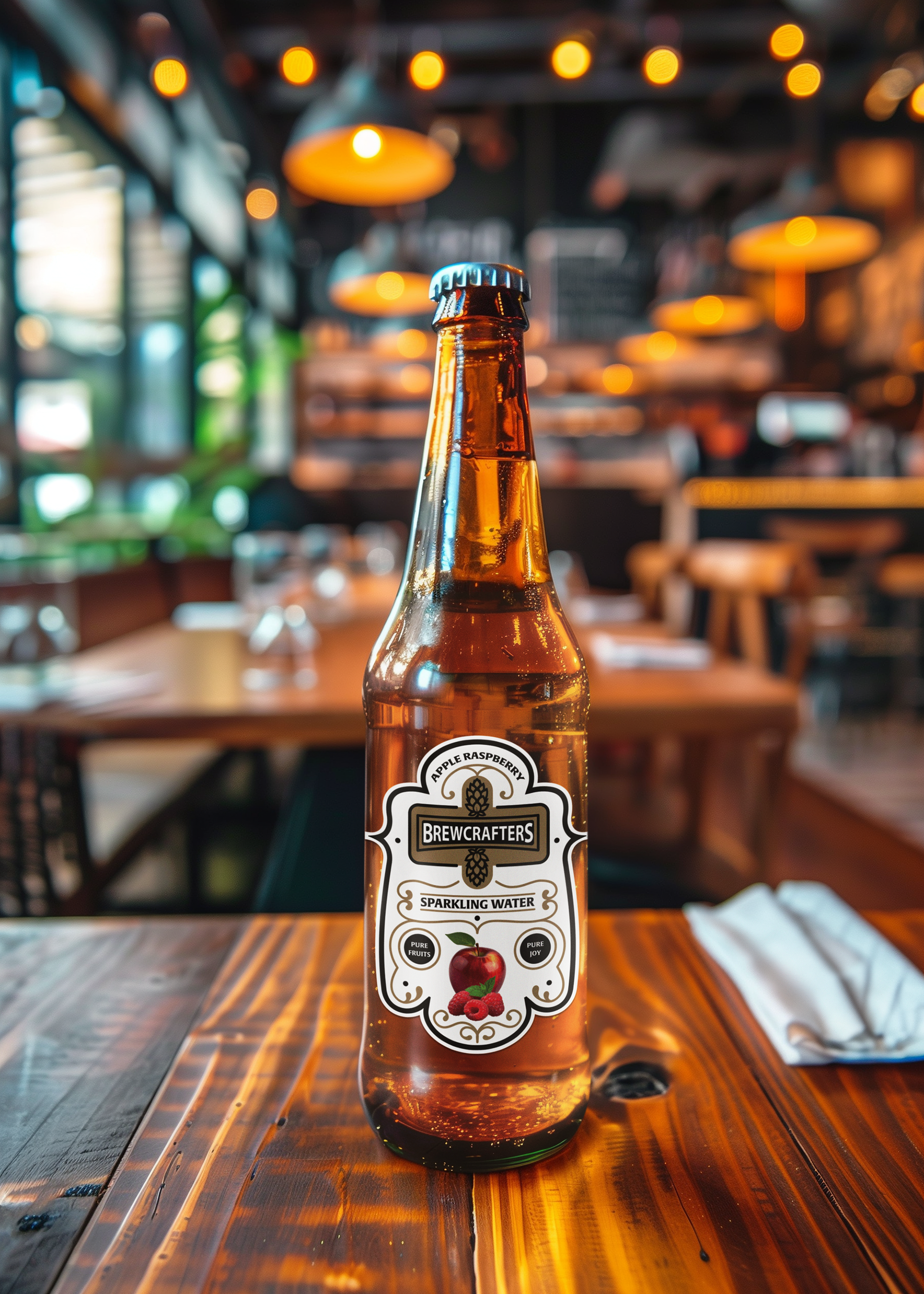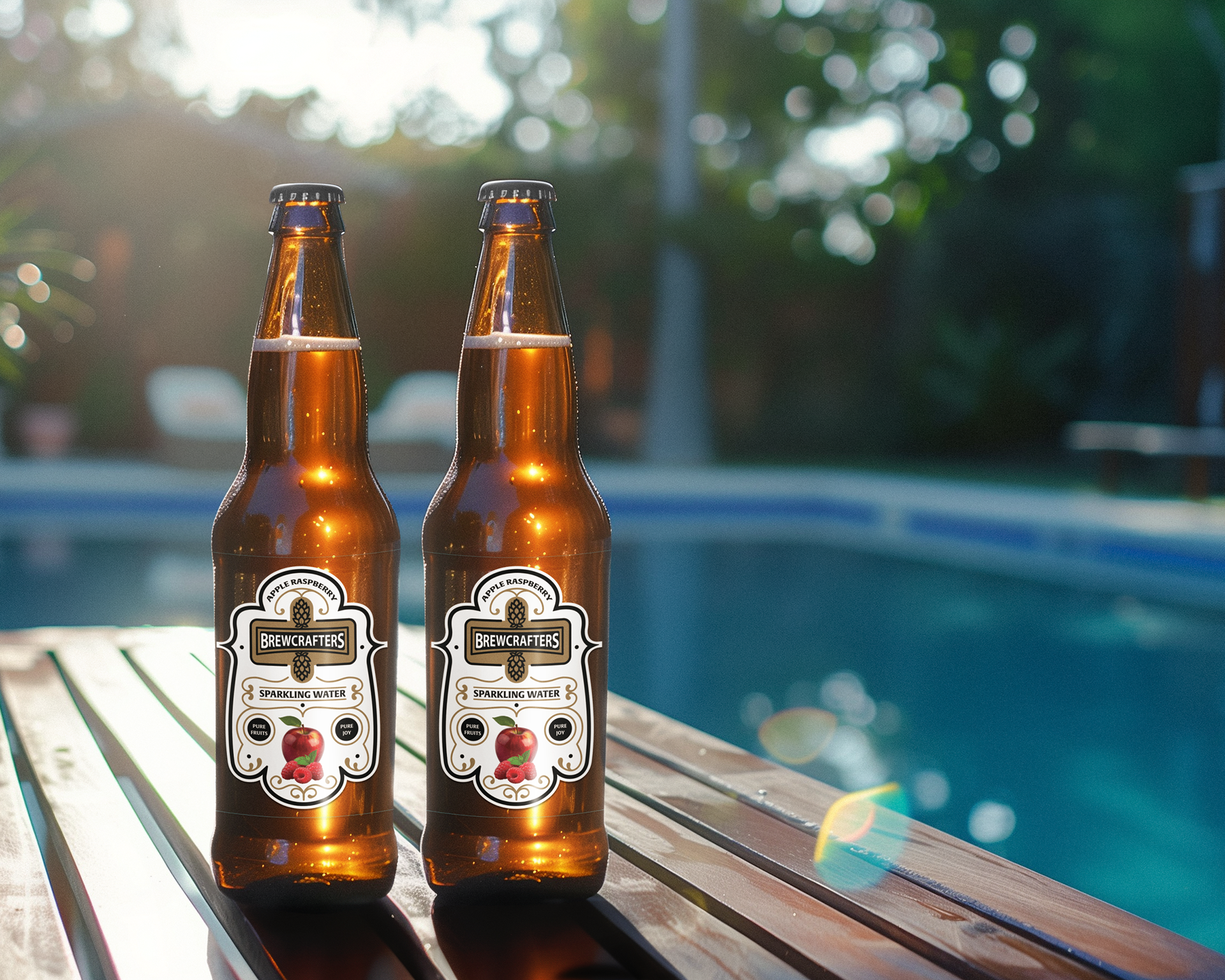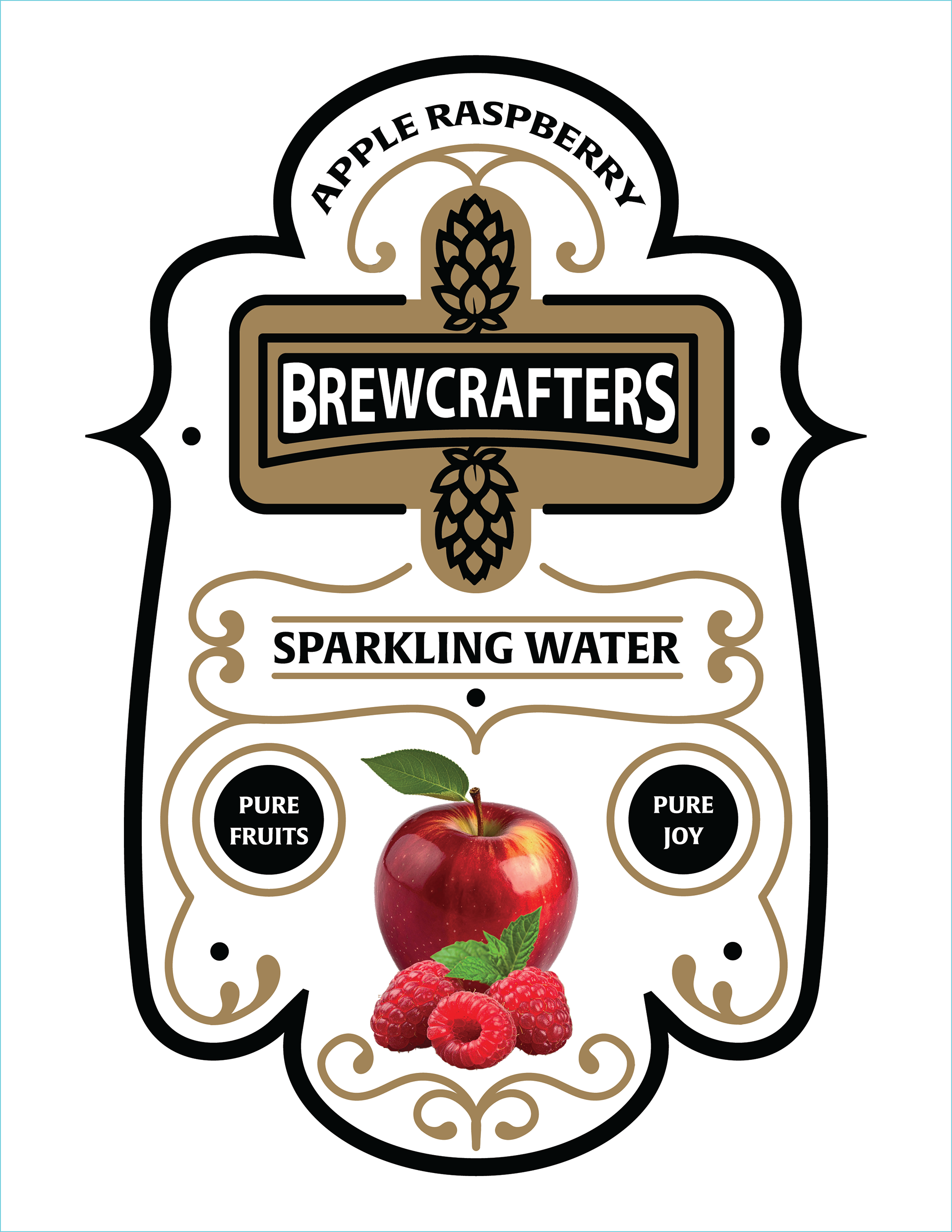


I designed a die-cut label for a craft beverage brand called Brewcrafters, working within a three-color limit and incorporating a provided logo. After researching craft beverage packaging, I sketched several ideas and chose the design I thought suited the brand best.
The three-color limit was definitely challenging since I had to figure out how to create visual interest with limited colors. I wanted to make the brand feel premium and visually interesting while still staying within the color restrictions, which pushed me to rely more on decorative elements, contrast, and thoughtful color choices to achieve the final look.
The final label uses a light, clean palette with white and soft tones to reflect a crisp and refreshing feel. I added gold swirls and decorative elements to give it a more premium and polished look while keeping the design minimal and not too overwhelming.