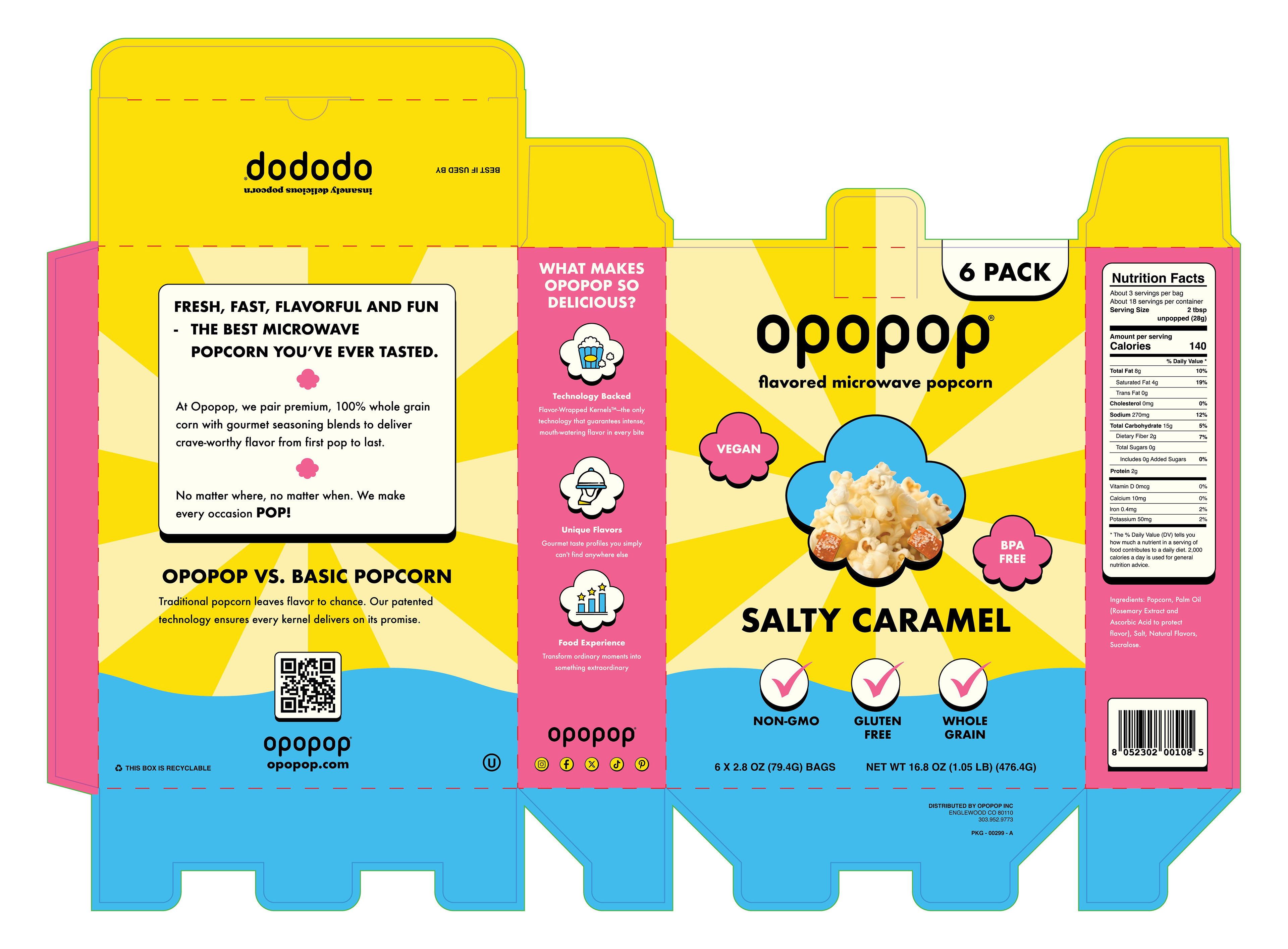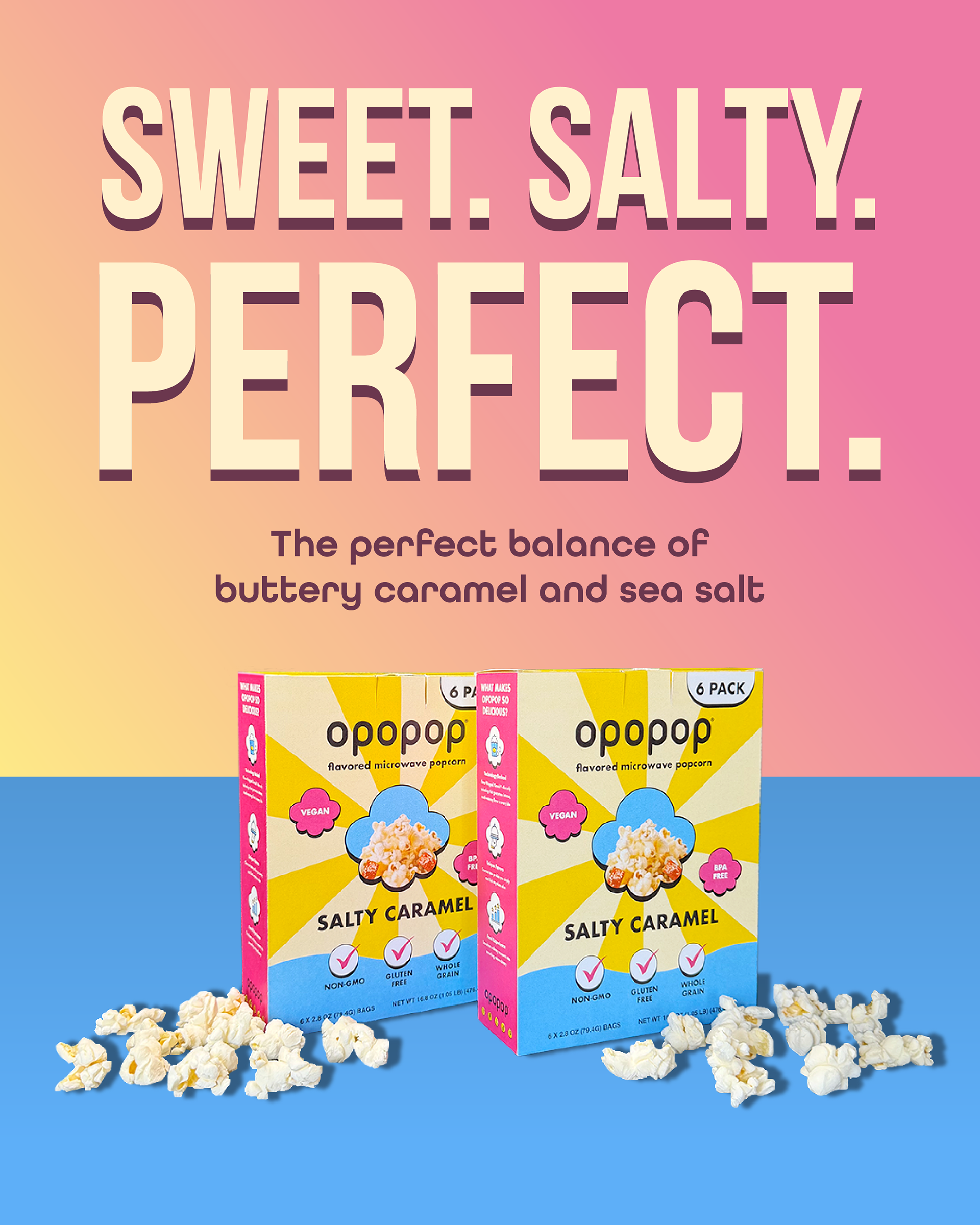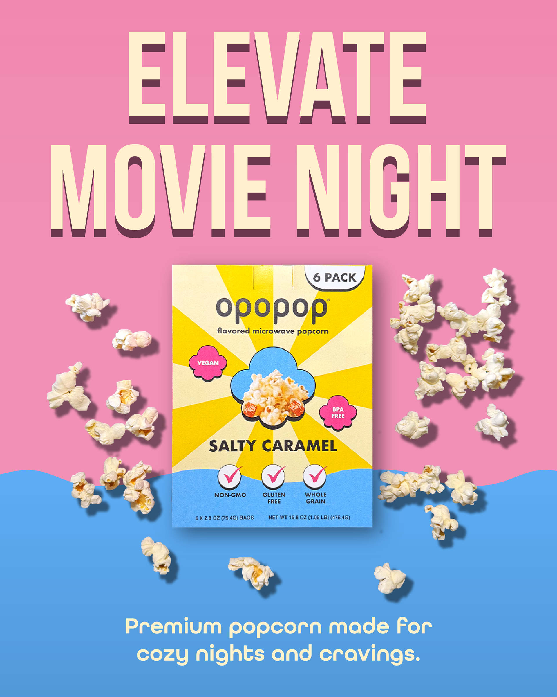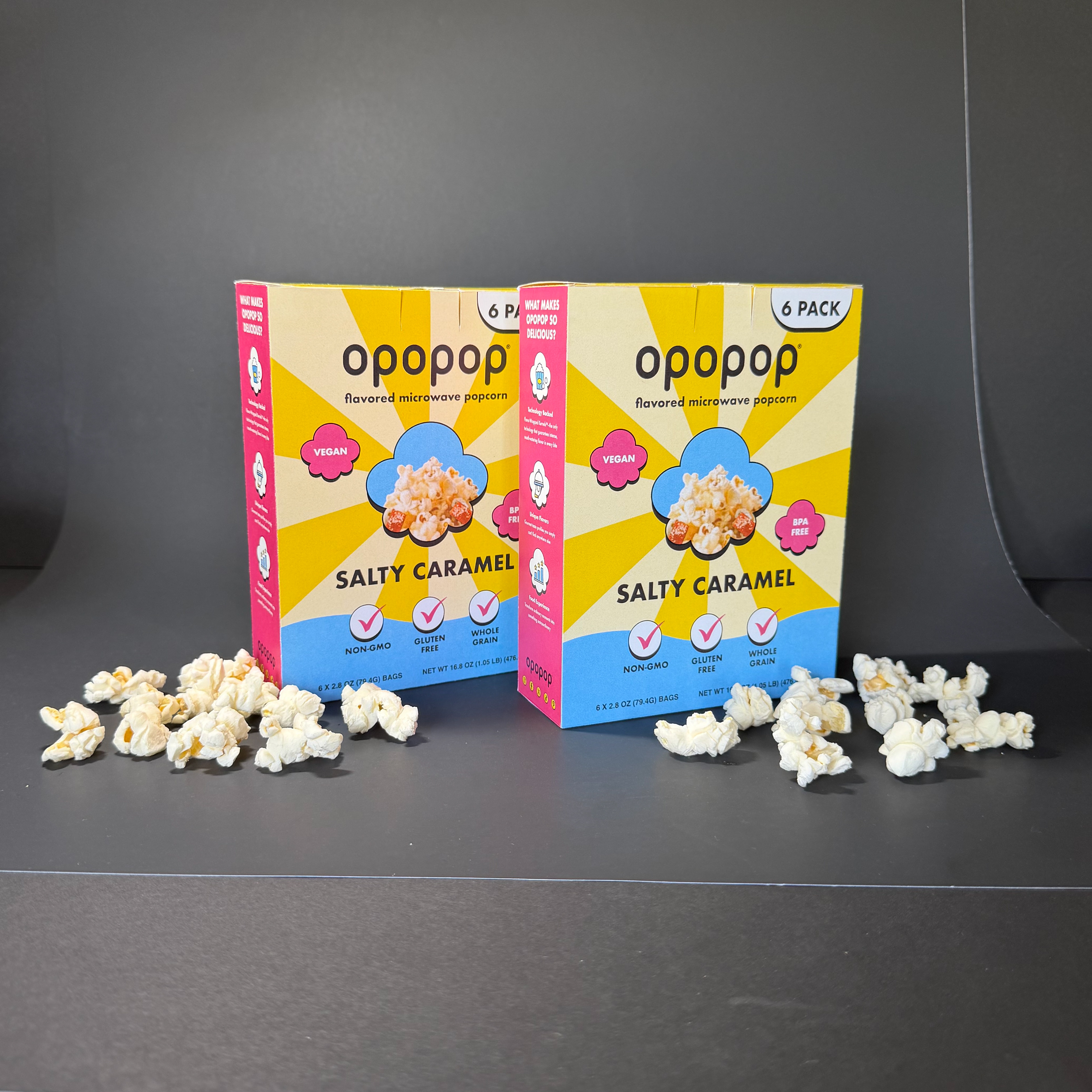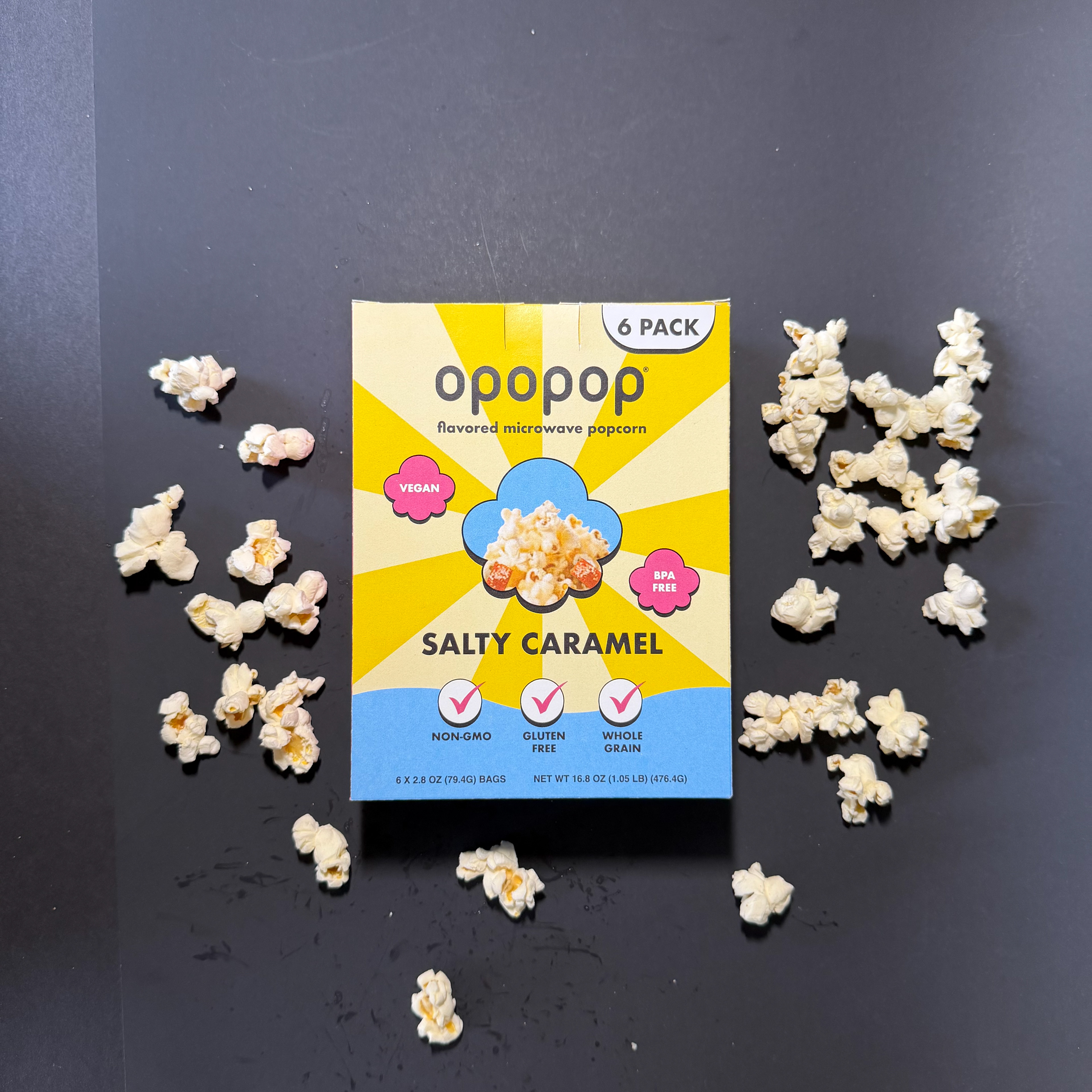


When redesigning the Opopop Salty Caramel popcorn box, my goal was to improve the visual hierarchy while staying true to the brand's vibrant personality and recognizable identity. When doing my research on popcorn packaging (both in-stores and online) I noticed that a lot of brands rely on similar food photography, layouts, and color palettes, which make the aisle feel repetitive. I wanted to create a design that better reflected Opopop's fun and energetic branding while making key information easier to read at a quick glance. By simplifying the layout and adding playful graphics, I wanted to create stronger shelf appeal and help the product stand out from competing popcorn brands!