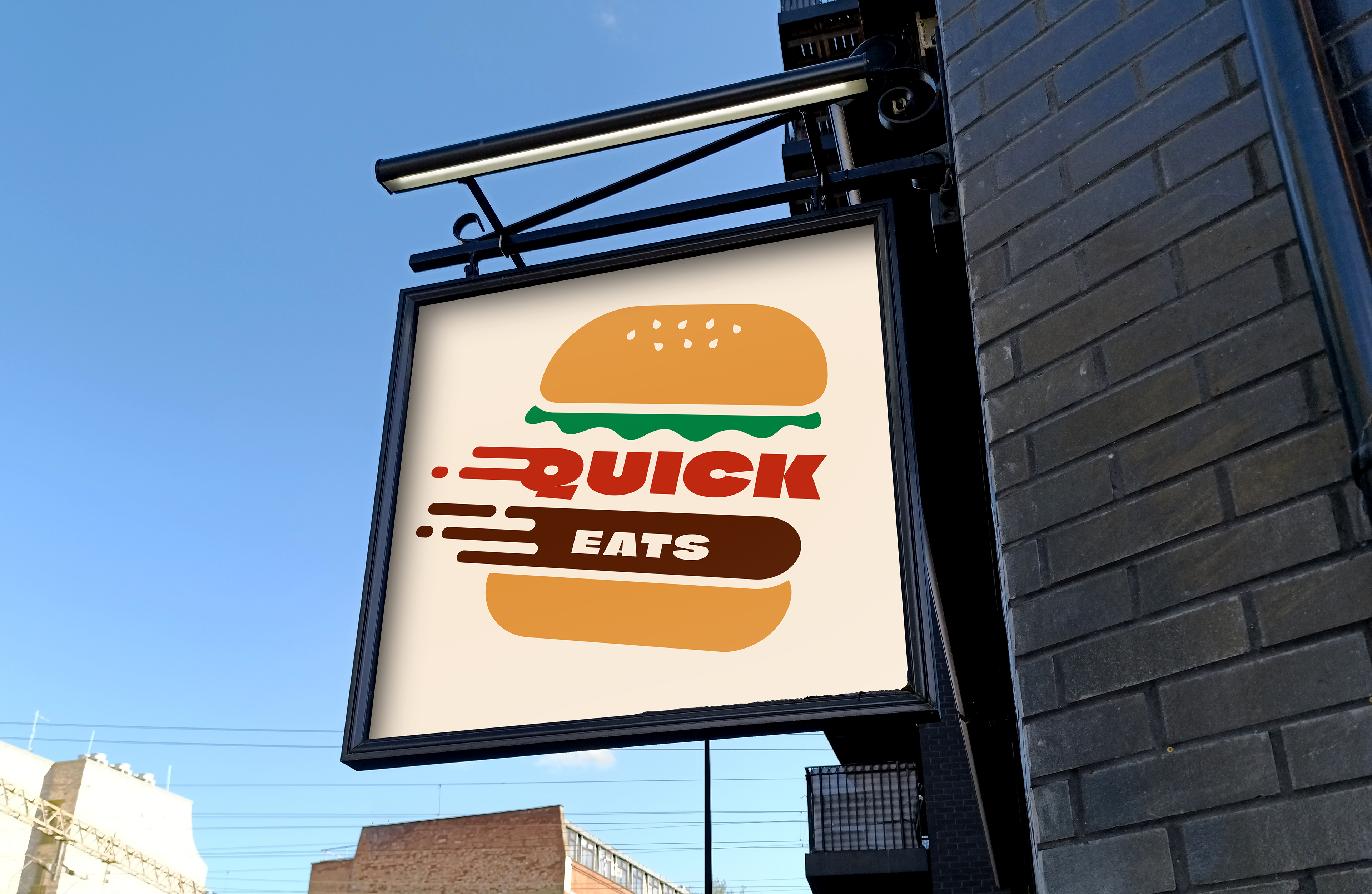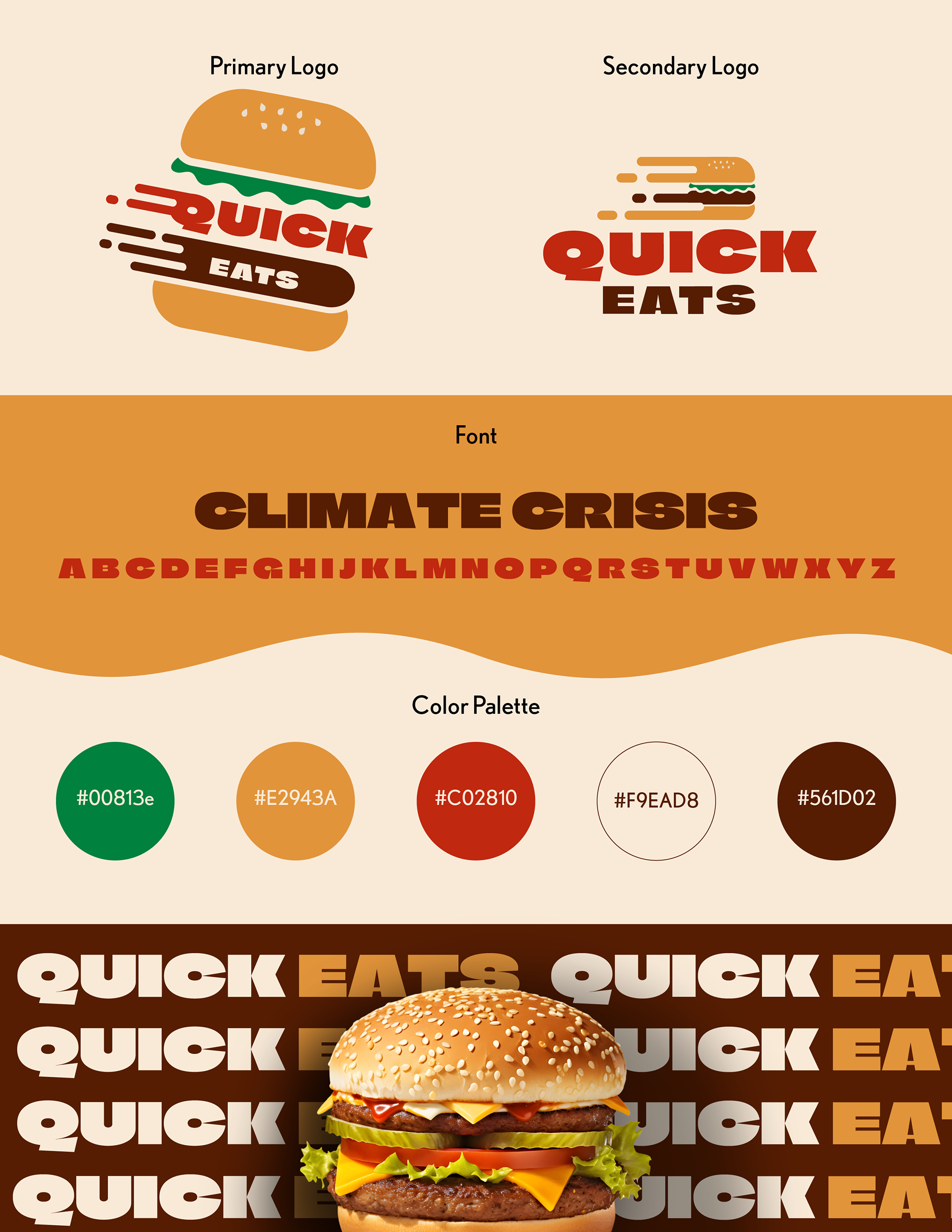


I developed the logo and branding for a fast food chain called Quick Eats which was aimed at young adults looking for quick and convenient meals. I researched existing fast food branding and explored multiple concepts before refining the final direction.
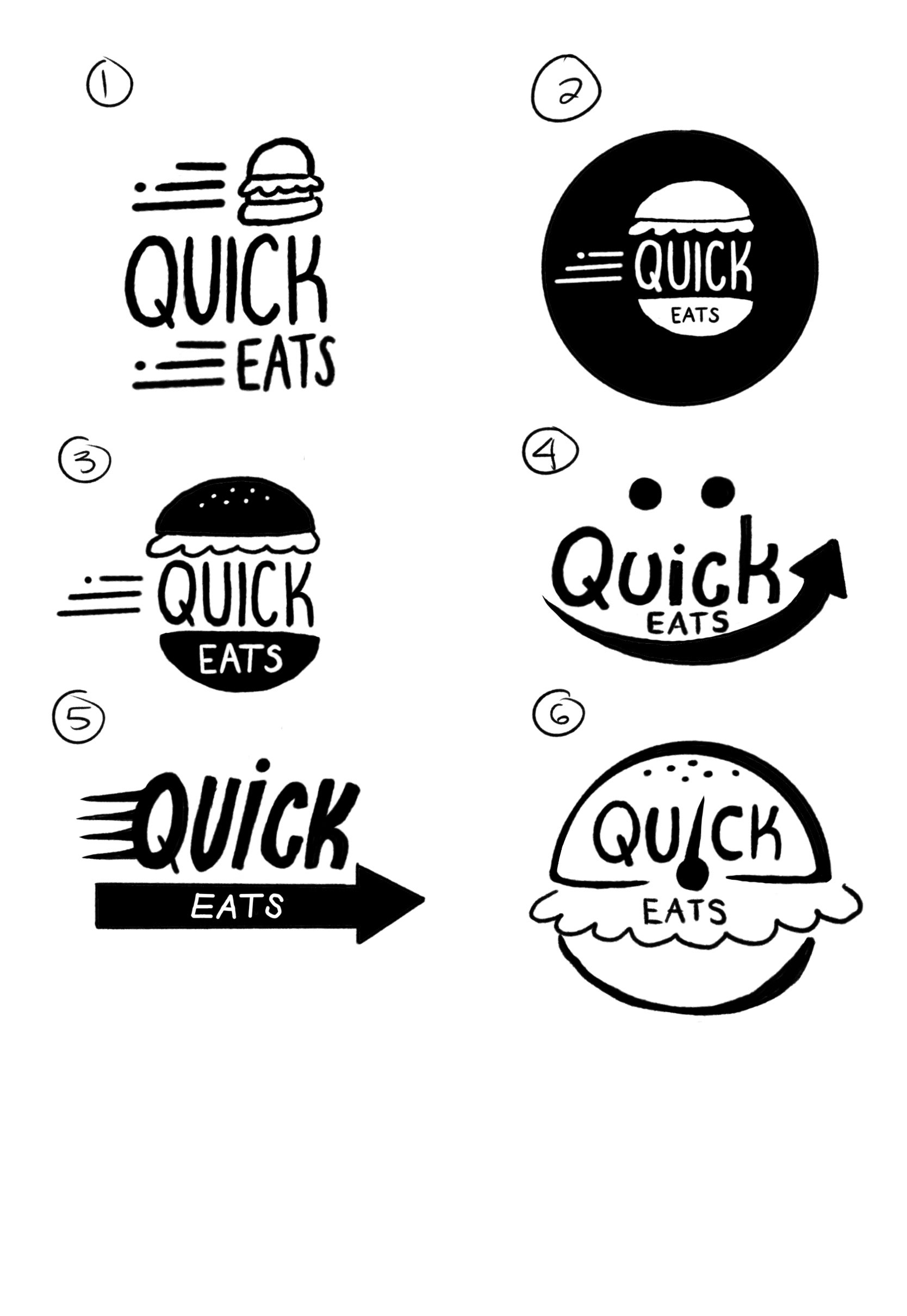
When creating the logo, I had to figure out how to design something recognizable while differentiating it from competitors like McDonald’s, Burger King, and other fast food brands. I wanted the logo to feel unique and memorable while still remaining practical and functional. It also needed to be easily readable, especially from a distance on signage.
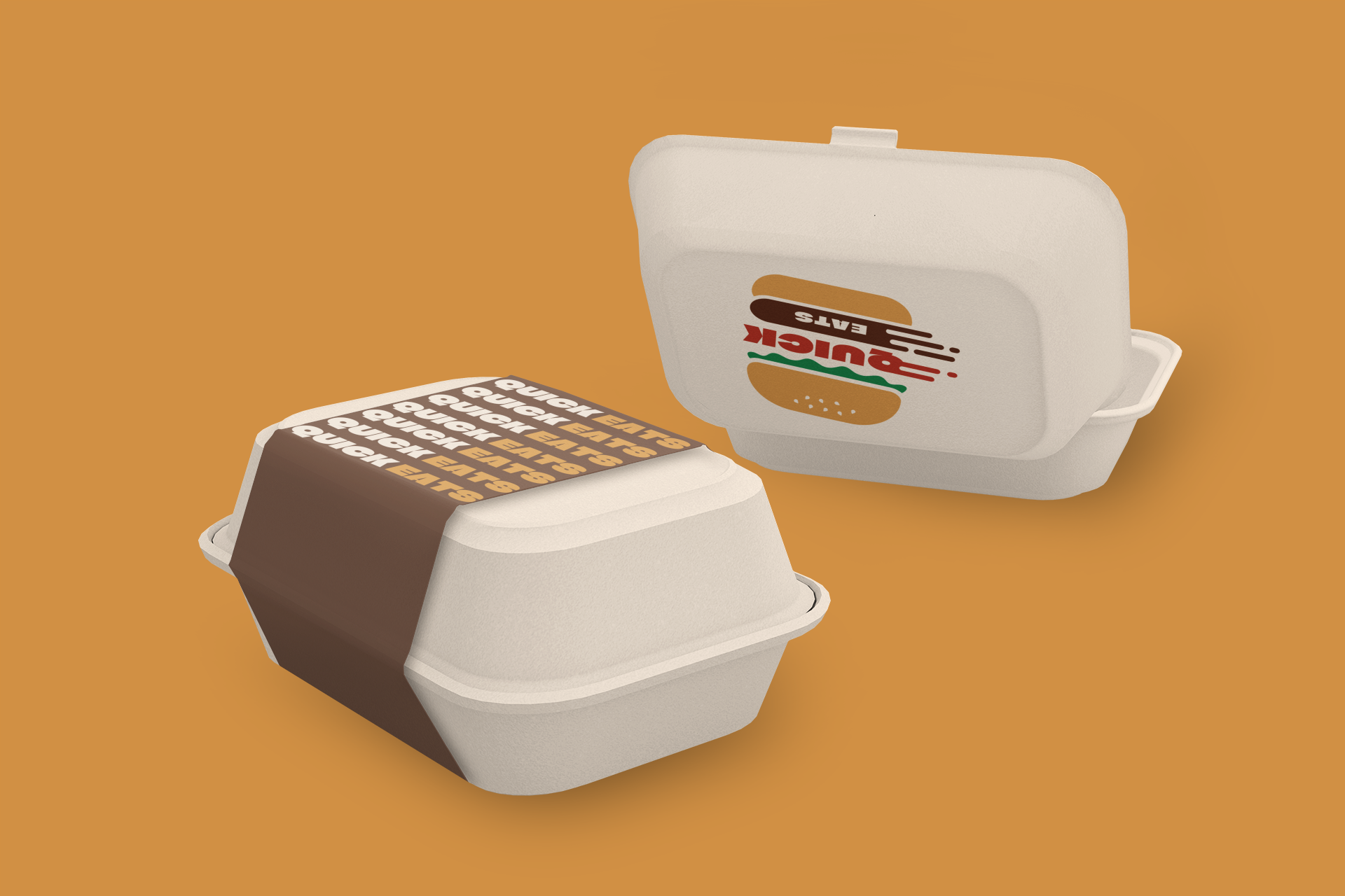
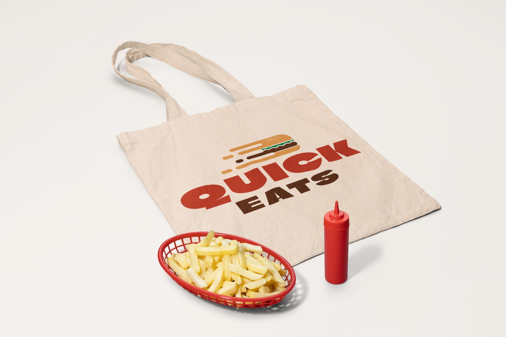
The final design uses red, yellow, and brown to create an energetic and appetizing feel. To reflect speed, I incorporated motion elements like a tilted burger and subtle motion lines while keeping the look simple. I also created a secondary version for better readability at smaller sizes and for the logo to remain clear across different applications.