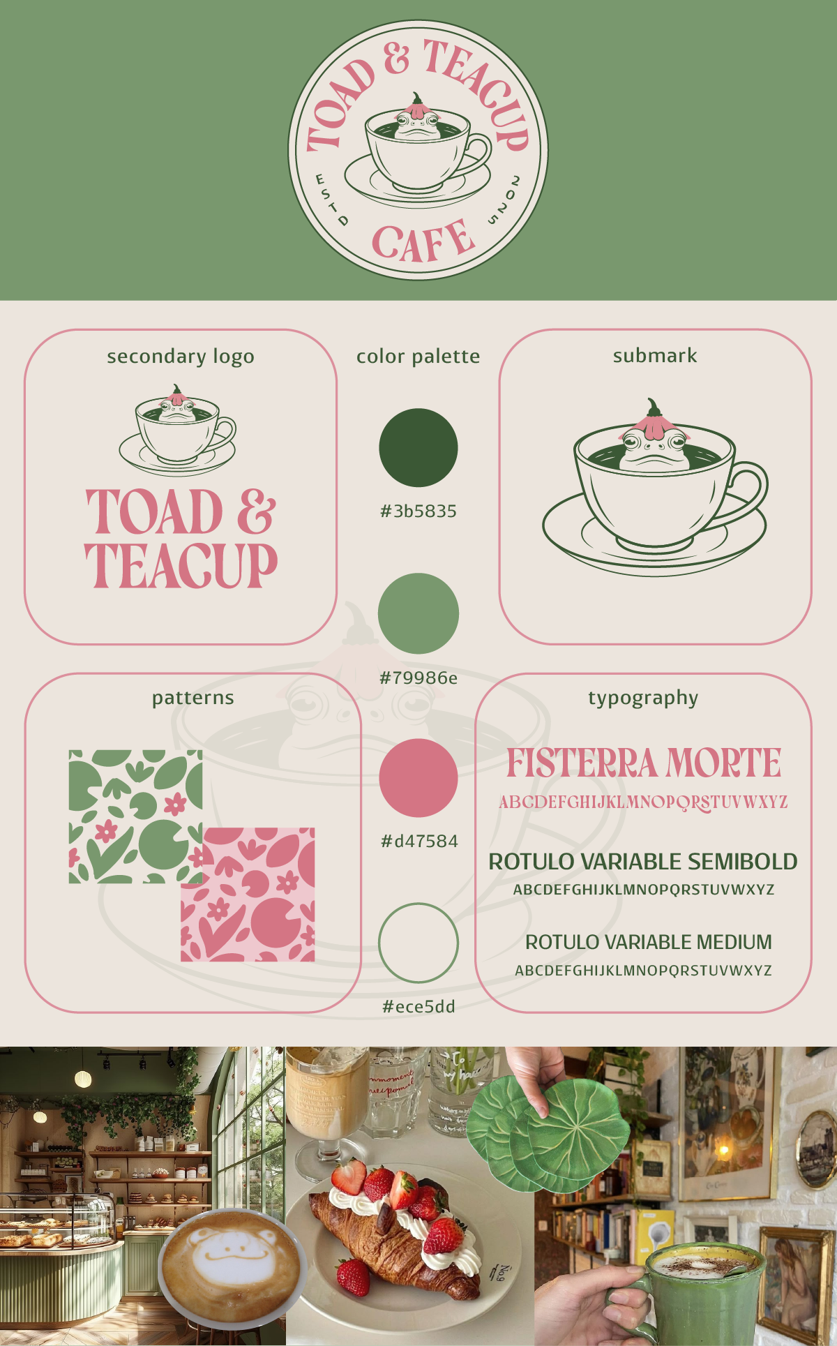

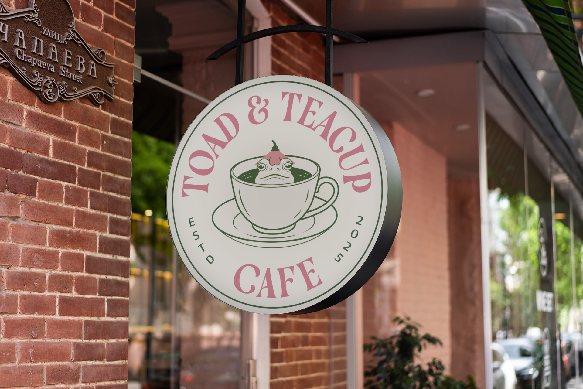
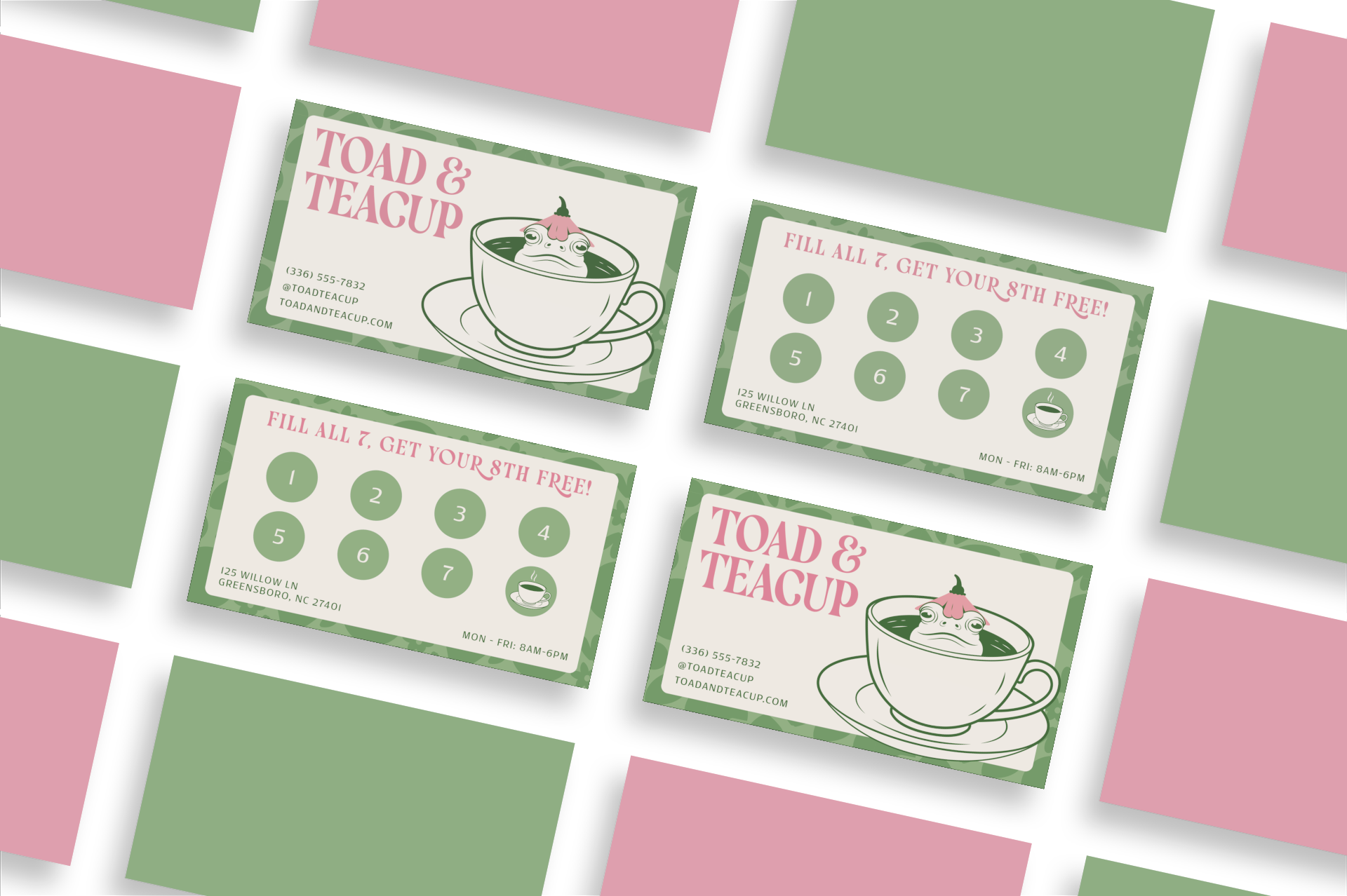
I created a full brand identity for a cafe called Toad & Teacup Cafe. I developed the name, logo, visual style, and brand materials and aimed for a whimsical feel that still feels refined and welcoming to a wide audience.
I didn’t want the brand to feel childish, otherwise it would seem like it was geared toward children, so that became a challenge. I initially considered making the toad look more cartoonish, but I didn’t feel like that matched the direction of the brand. Instead, I opted for a more realistic looking toad, though I only drew the outline rather than fully shading it and making it extremely realistic.
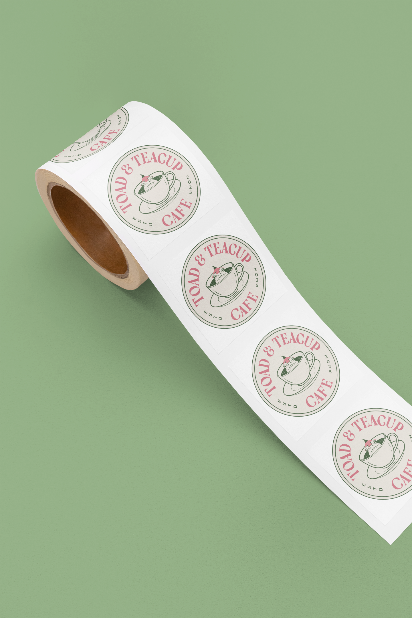
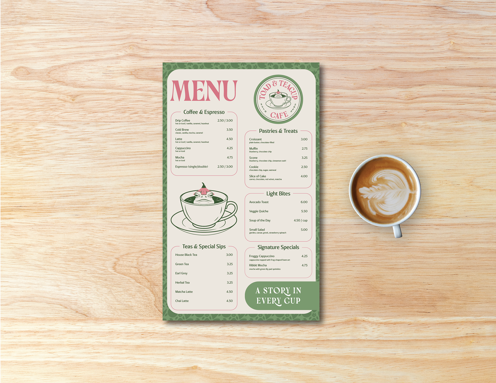
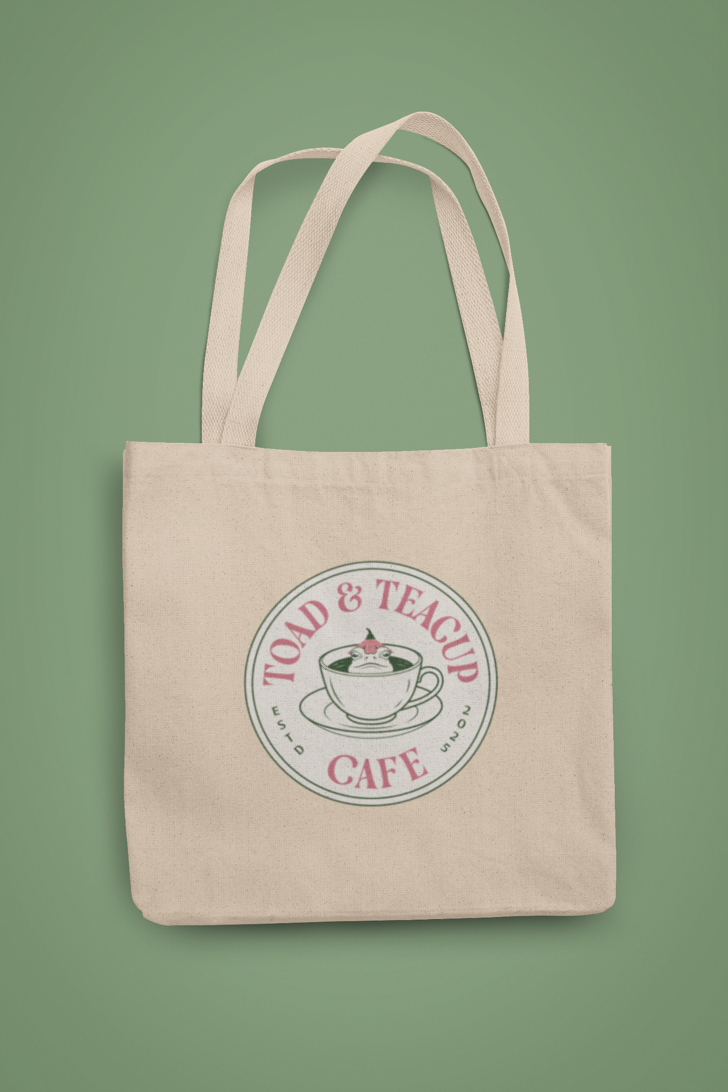
The final design uses muted greens and soft pinks for a cozy, natural look. The final logo features a toad sitting in a teacup with subtle floral details, paired with a decorative serif and clean supporting fonts for balance. I also designed patterns, business cards that double as loyalty cards, and a handheld menu with the tagline A Story in Every Cup. This project helped me further develop my branding skills by balancing playful visual elements with a more polished and intentional design style.
Style Guide: